Pre-Launch Magic: How to switch from “I want to sell” to “You want to buy”
June 28, 2016Nobody Cares About Your Feature List
November 29, 2016The Art Of Calls-To-Action (CTA) And How To Nail It

The complete guide for understanding and optimising CTAs
As the name suggests, in digital marketing, a Call To Action (Also known as CTA) is a term used to describe words or graphics that urge your website visitor to take an immediate action. From “Click Here” to “Request a Demo”, they all have one thing in common – they require your visitor to do something to push her down a specific path.
If you ever read something about inbound marketing and conversion funnels you probably stumbled upon this term more than once. However, most guides and articles treat CTA as if they were the sole property of a transactional funnel, a way to move your client down the buying journey in the hope to convert her from lead to a client.
While this is true and indeed very important (and I will elaborate on this below), I like to break the CTA into two types: The Navigational CTA and the Transactional one.
Let’s start with the Navigational CTA as I believe it’s the basic to understanding CTAs.
Navigational CTAs
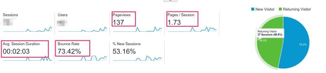
The objection of Navigational CTA is to get your website visitor to absorb as much information from your website before they bounce out.
From an Analytical point of view, if you get the Navigational CTA right you should see improvements in these data points: Number of pages per each session, the number of overall page views, Avg. Session Duration and Bounce rate (How quick users leave your website)
But why is it so important for you from a business perspective?
Because it’s your way of taking control over the visitors’ journey, the type of information they collect and to manipulate their steps so you would achieve the best results.
Without it you are counting on them to check out all the items on the top menu, basically letting them choose if to read, what to read and in what order.
It takes two to tango, and one has to lead! It might as well be you.
Let’s examine 2 scenarios of implementing a navigational CTA as an example:
1. Service providers: There are usually 3 important parts for service providers, and you want to make sure they are all linked together: Information about the service provider, information about the services provided and how to contact you.
You should be checking that your home page is directly referring to one of this pages (not just have it on the top menu, but have a button or section that leads to more information). Ideally, this will lead to the information about the different services you are providing.
From there, on the services page, you should make sure you are directing them to contact you.
Same goes for the “about you” section. If someone visits this page, you have to make sure it’s not a dead-end, and they have a way out of there other than the top menu. Let’s have a look at my “about me” section as an example:

2. Content providers – do you have a blog? Do you live off content? Great. That means you have to get visitors to read more and more pages.
Your task is to get them to continue browsing through your website until they are either too bored, too busy or simply had enough. One of the best ways of doing it is by offering more relevant content and suggested reads.
You don’t have to be a big publisher like the Huffington Post to take advantage of tools like “trending topics”, “what’s hot”, “you may also like this” etc. but take a look at how these guys are nailing it:


Another way is to use internal linking to other relevant posts.
Here’s how Neil Patel does it:

That’s pretty much the science behind Navigational CTA – once you understand you are the one that needs to be in control and lead the user through the website journey, all you have to do is to map it out and create the right pathways.
Transactional CTAs
As mentioned, this is probably the most common type of CTA that everyone is raving about and for a reason. This is the Call-To-Action that is designed to get your visitors to take a real action and interact with your website/product.
Whether it’s a small step (micro-commitment like watch a video) or a big one (macro-commitment like starting a trial or giving you their email address) – these are actions taken by your customers because you asked them to do so. It makes sense to master this art as this is what helps with the bottom line of the business.
But what should you think about when you are creating CTAs?
1. Benchmarks – according to Hubspot a good CTA will have a 1-2% click-through rate (CTR) or 10% conversion rate on the landing page submission. So for each 100 people who visit your page, 2 should click on the CTA. For every 100 people who visit your landing page (after clicking the CTA), 10 should bite on the offer. This is, of course, a general benchmark, and it will be different from one industry to another. As a start, you should know your own conversion rate, set it as your benchmark and just strive to improve it.
2. Experimenting – what works for you and your target audience, will not necessarily work for others. That’s why it is so important to keep testing your CTAs and challenging yourself.
But before you dive in and start playing around with your existing CTAs or adding new ones, it’s really important to treat each change as an experiment. It means that you have to make the changes slowly, analyse the result and optimise accordingly. If you change too many things all at once, you will never know what was the one thing that made it better.
3. Context / Location / Timing – Where would you place your CTAs on a page (or in an email)? It all depends on the type of page it is on and what is the offer. For example – if you are trying to get them to download an eBook on the topic they are reading – you might want to save it to the end of the blog and place it on the sidebar. But if it’s an offer for a free shipping coupon on a store page, the top part of it might be better. If it’s trying to salvage a user before he is leaving for good, an exit pop-up will do the trick.
4. Visuals – How big they are? Do they stand out? Is it clear it’s clickable? Does it catch your eye? Can you add some images to it? Is a button enough? All of these questions and more are important but unfortunately there is no one simple answer or best practices guide because it’s all a result of the context, which leads me to the next point:
5. Target Audience – who is your target audience and what would be appealing to them? Do they like flashy colorful designs or do they prefer minimalistic ones? Do they like the pink colour or are they yellow fans? Do they have trouble reading and need a huge font or normal size buttons are good enough? I hope you see where I’m getting at by now. There’s no right or wrong. There’s what’s right for you and your target audience. Think about their personalities, demographic, culture, etc. and work your way up from there.
Oh, and test, test, test…
6. Texts – this is probably the most important part of the CTA and that’s why it has to be clear and to the point. Don’t make them think hard about what they need to do or what will happen if they click – just tell them! For example: “Download the free guide to starting with SEO” (this pretty much says: you will be able to download something It’s a guide, and it’s free – it doesn’t get any clearer than this) or “Yes, I want to learn more about SEO Wizards” (a more personal way of putting the call to action in the reader’s own words).
From Micro CTAs to Macro Ones
Before I wrap this up, I wanted to share some final notes about this issue.
A lot of good marketers and business owners sometimes forget that requesting an email address or filling out a form is like asking our customers for a significant commitment.
Although it looks like you are “just asking for their email address” , think about yourself when prompted with this request. You are probably wondering why do they need it, is it for spam, what will you get out of it, etc. – you become suspicious very quickly, and so are your visitors.
One of the ways to tackle this is to create micro-commitments. Things that help your users feel safer and feel like they are ready to commit (after all they have come so far, and it is interesting.).
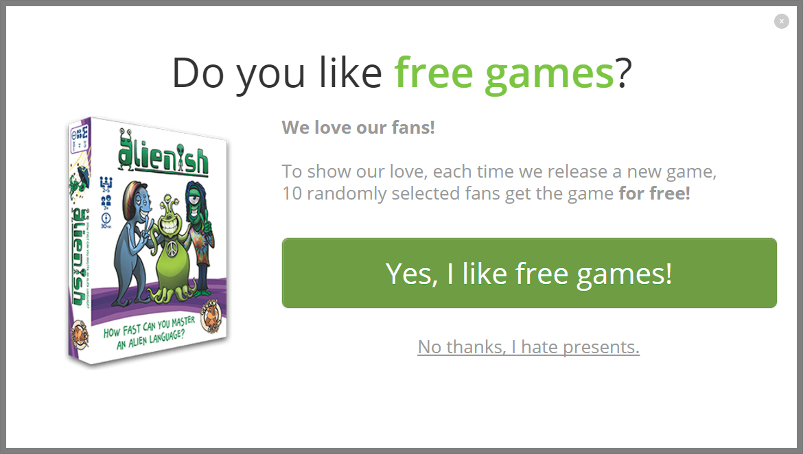
Here’s a nice example from Quokka Games’ website – instead of asking the user to subscribe, they asked them if they want to get a gift. Now who doesn’t want to get a gift? Once they clicked they do (and made the micro-commitment) – then it’s easier to get them on board:
There are other good techniques of moving from your visitors from making small commitments to bigger ones. Here’s a good read about the science of micro-commitments by CrazyEgg for those of you who wants to explore it further.
That’s it about CTAs for now and here is my little experiment – if you like what you read and found it useful would you mind clicking on the share buttons below and tell the world about it? That’s my call-to-action of the day for you 😉
Till next time…


